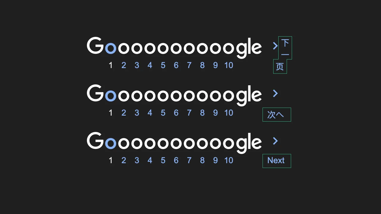
A subtle layout bug in Google Search: When CJK text-wrapping meets float
/ 4 min read
Recently, I investigated an interesting layout bug in Google Search’s pagination component. I first noticed it a few months ago but thought it was caused by some Chrome extensions I had installed. Later, I set up a fresh browser profile and reproduced the issue, realizing it was a broader problem.
The bug specifically affects the Chinese version, where the “Next” link (下一页) wraps onto multiple lines unexpectedly. It looked like a simple CSS issue at first, but a deeper dive revealed some fascinating quirks involving CSS layouts and CJK (Chinese, Japanese, Korean) text rendering.
A Closer Look at the Bug
Let’s break it down. The “Next” link in the pagination component is made up of two parts:
- A logo image
- The localized text for “Next”
Here’s a simplified version of the HTML:
<td> <a href="#next" style="display: block;"> <img src="next.png" style="float: left; display: block; width: 71px" /> <span style="display: block; margin-left: 53px;">下一页</span> </a></td>The issue comes from the float: left applied to the image, combined with the lack of a clear property on the text span. To fix it:
- Remove
float: left, or - Add
clear: leftto thespan.
Real Question
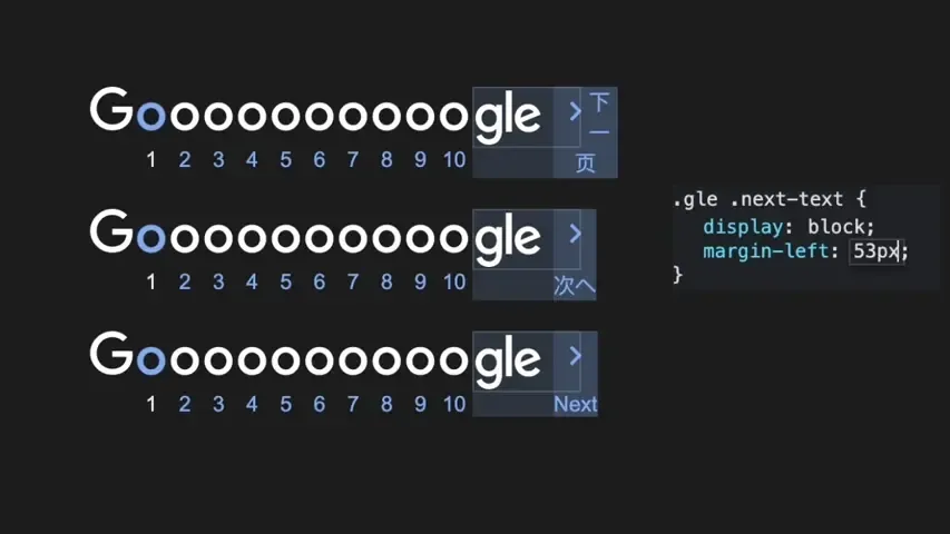
Why does this bug only show up in the Chinese version? To figure that out, let’s look at how text wrapping behaves in different languages when the span text’s margin-left changed.

From this visualization, we can see:
- CJK and Latin text wrap differently.
- The
spantext first appears below the image, but as themargin-leftincreases, it shifts to the right.
CJK Text-Wrapping
CSS uses the overflow-wrap and word-break properties to control text wrapping behavior. Under the default values of these two properties, most languages break lines at spaces between words. However, CJK languages don’t rely on spaces as word separators, which allows line breaks to occur between any characters.
The Issue Sweet Spot
But why are the Japanese and Korean versions unaffected? This is where it gets even more interesting. Let’s take a closer look at the block-level span text in the HTML. Its previous sibling (the image) is floated, which means the image is removed from the normal content flow according to CSS rules. As a result:
- The
spanstarts at the same position as the floated image. - Its content aligns to avoid overlapping the float, meaning:
- If there’s enough space beside the floated image, the content flows into the remaining space next to it.
- If there isn’t enough space, the content moves to the next available line below the float.
But when is there enough space beside the floated image? This depends on the width of the parent container. In this case, the parent <a> tag is a block element inside a <td>, which means its width is content-based. Its width is determined entirely by the wider of its two children—the floated image or the span text.
With this understanding, the conditions for wrapping are clear: if the width of the span (including its margin-left) is larger than the floated image, and the gap is just enough to fit a character, the span may wrap around the image. In the Chinese version, the text 下一页 contains three characters, while the Japanese and Korean versions only have two. This subtle difference causes the issue to occur exclusively in the Chinese version.
Now, why does it matter that the span is a block-level element? Because as a block element, it respects the float and makes its content sit beside it or moves below it. If it were an inline-level element, it would try its best to flow inline next to the image, making the issue visible across all languages.
One More Thing

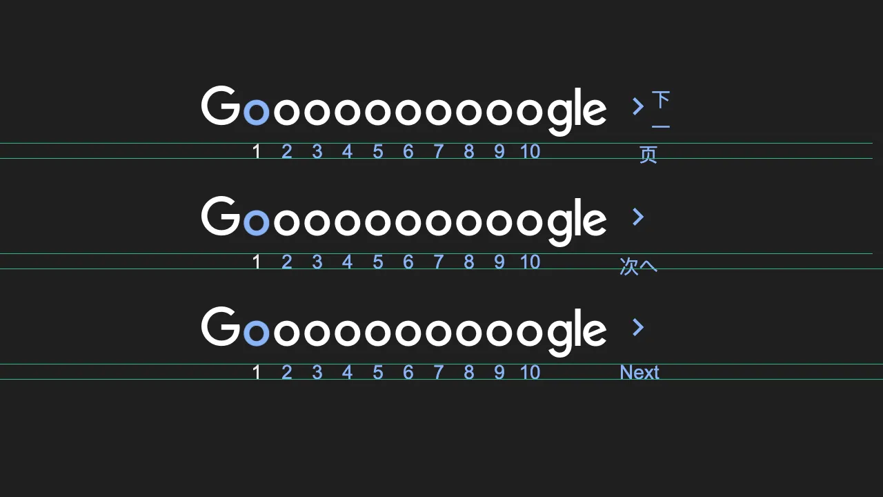
While examining the layout of the pagination component for this post, I noticed another issue: the page numbers and the “Next” text are slightly misaligned in CJK languages. It’s not a major problem, but for a platform like Google, even small details matter. The fix is simple—apply a unified line-height to the text.
This happens because CJK text often falls back to a different font family than Latin text. Since different fonts have unique vertical metrics, such as baseline and line box properties, the text can appear misaligned when displayed together without proper adjustments. The fix? Use a consistent font-family or explicitly set line-height.
What We Can Learn
This quirky bugs teach us some important lessons:
- Test with CJK Languages: Don’t assume layouts will work universally. Always test localized versions.
- Floats Are Tricky: Floats are kind of outdated. Use Flexbox or Grid for layouts when possible.
- Mind Font Fallbacks: Different fonts may have varying vertical metrics, causing alignment or layout issues when mixed.